Campus Communication Toolkit
Introduction
The Eliminate Tobacco Use Initiative was founded by The University of Texas MD Anderson Cancer Center and The University of Texas System in 2015. The national initative grew out of foundational work in Texas as the initiative’s first state site. The primary aim of the initiative is to address tobacco use across colleges and universities and more effectively contribute to actions that create a tobacco-free culture.
VISION
The Eliminate Tobacco Use Initiative is working to create tobacco-free cultures on institutions of higher education through policy, prevention and cessation.
GUIDING ELEMENTS
- Action oriented
- Sharing best practices
- Evidence-based
- Health equity lens
- Customizable + tailored
- Forging connections
AUDIENCES
Audiences served by the ETU Initiative include students, faculty, staff and patients at all types of institutions of higher education, including universities, colleges, seminaries, institutes of technology, vocational schools, trade schools, and other career colleges that award degrees. This also includes the communities within which these institutions reside.
BRAND ARCHITECTURE
BRAND POSITIONING
When customizing text and visuals for your campus, follow these tips and guidelines for a successful campaign.
DO THE FOLLOWING:
- Stories are powerful health communication tools. Use of personal stories, narratives and testimonials can be an engaging and persuasive approach.
- Be patient. Education and behavioral change is a process.
- Use sympathetic language and be understanding. Addiction is a disease and most people try to quit many times before they are successful.
- Use communication that is more of a “nudge” than a “nag,” and always approach from a position of support; use an approachable, gentle tone while still having a clear stance.
- Provide novel and useful information to tobacco users and avoid relying on general statements such as “tobacco kills.”
- Instill confidence in those trying to quit, or reduce tobacco usage by directing users to smoking cessation hotlines, websites or on-campus resources.
- Be supportive and provide clear direction to resources.
AVOID THE FOLLOWING:
- Don’t highlight the behavior you want to avoid (e.g., showing someone smoking).
- Don’t accuse or persecute people who are active tobacco users.
- Don’t blame or shame tobacco users for existing health issues/concerns.
PARTNERSHIP
FOUNDERS + ATTRIBUTION
FOUNDING PARTNERS
MD Anderson and UT System are “founding partners”, whereas all other partners of the national initiative, state initiatives or at Summits should be referred as “partners”.
ATTRIBUTION GUIDANCE FOR PARTNERS IN TEXAS
FOUNDING PARTNERS LOGO PLACEMENT
Include the text header “Founding Partners” on materials that reference the Texas-focused efforts for the initiative. Place the University of Texas MD Anderson Cancer Center logo first/on the left followed by the University of Texas System logo next/on the right.
ATTRIBUTION STATEMENT
For products (i.e. websites, toolkits, reports and presentations) that include background information on the initiative, ensure the following text is used: “The Eliminate Tobacco Use Initiative was founded by The University of Texas MD Anderson Cancer Center and The University of Texas System.”
ATTRIBUTION GUIDANCE FOR PARTNERS OUTSIDE OF TEXAS
FOUNDING PARTNERS LOGO PLACEMENT
For current partner sites outside of Texas, please use the text “Founding Partner” with the MD Anderson logo only.
ATTRIBUTION STATEMENT
When the logo is not appropriate to use (for format or space considerations), ensure that the following text is included: “The Eliminate Tobacco Use Initiative was founded by The University of Texas MD Anderson Cancer Center.”
MD ANDERSON APPROVAL
If there is a desire to include any other organization’s logos in addition to MD Anderson’s or UT System’s as founding partners, please ensure that two weeks’ notice is allocated for additional review and discussion by the MD Anderson Brand Team before proceeding.
BRAND IDENTITY
INITIATIVE LOGO - FULL COLOR
Two color logo to be used on the majority of materials.
INITIATIVE LOGO - ONE COLOR
If for budgetary or other reasons a one-color logo is necessary, use the black or white logo version.
CURRENT PARTNER LOGOS
The current partner logos are composed of the initiative logo and partner name with “Initiative” on a single line.
The initiative typesetting is created using Univers Ultra Light (in a brand-designated accent color) at 40 pt kerning and 2.125 pt stroke with round corner.
Current partners should reference their individual brand guidelines for additional guidance.
SUMMIT LOGOS
Each year the Eliminate Tobacco Use Initiative hosts a national summit and several partner summits to share information regarding tobacco control policies, prevention and public education campaigns, and cessation services and best practices.
The national summit logo is composed of an initiative logo (top) and “Summit [Year]” (bottom) on a single line using Universe Ultra Light (in white, accent yellow, and secondary blue) at 40pt kerning and 2.125pt stroke with round corner.
For horizontal version of the partner and summit logo please contact the UT Center for Health Communication at healthcomm@austin.utexas.edu.
LOGO USAGE
CLEAR SPACE
To ensure the logo has consistent, optimal legibility and prominence, an area of clear space should be maintained around the logo. This distance should be equal to or greater than the height of the logo.
Do not place any other elements including text or graphics in the clear space.
This same clear space requirement applies to the partner sites and Summit logos.
SIZE PARAMETERS
To make sure that the logo elements are always clear and legible, follow the minimum sizes for print and digital shown here.
IMPROPER USAGE
COLOR
TYPOGRAPHY
By using different typefaces, we can establish hierarchy and direct the flow of reading. For body copy, use the primary typeface titled Univers 45 Light. For headers, titles and other call-outs, use the secondary typeface titled Univers 59 Ultra Condensed.
Because of licensing restrictions, Eliminate Tobacco Use cannot provide font files.
PRIMARY TYPEFACE - UNIVERS 45 LIGHT
SECONDARY TYPEFACE - UNIVERS 59 ULTRA CONDENSED
SYSTEM FONTS FOR MICROSOFT OFFICE - ARIAL
IMAGERY
PHOTOGRAPHY
Photography can be a great way to connect with our audiences by instilling confidence in those trying to quit or reduce tobacco use. When selecting or shooting new photography, be sure to follow these guidelines to maintain our visual identity.
- Select images that convey support or tell a story.
- Use natural light for your photos when possible and capture candid moments.
- Represent diverse groups of people and a mix of students and professionals.
GRAPHIC BRAND ELEMENTS
Use the supporting graphic elements to visually support the Eliminate Tobacco Use brand and help communicate the tobacco-free message.
WAVE PATTERN
The wave pattern is used over the secondary blue color or without a background in one of the brand colors. It’s designed as a background treatment for all initiative, current partners, and summit materials.
BOLD ARROW
Bold yellow arrow is used to draw attention in copy block or direct the eye in an infographic.
ICONOGRAPHY
Where it is feasible, we prefer the use of smoking and tobacco icons without the red cross-out circle. While the red cross-out circle is a universal way of communicating “no” as it relates to tobacco-free policies and what is not allowed, we are aiming to reduce negativity and stigma by eliminating use of these when possible. This is a visual communication method for positive framing, aiming to harness the ability of positive visual images to induce positive attitudes toward the message.
PERMANENT SIGNAGE
Campuses can utilize the Tobacco-Free and Vape-Free marks in combination with their visual brand to create school-specific permanent signage, such as exterior signage.
POLICY, PREVENTION AND CESSATION
These three icons represent three pillars of the initiative and are for use throughout communication materials as supporting graphics. Icons should appear as outlined vector lines with a rounded corner in initiative orange, black or white.
WRITING STYLE
Utilize Associated Press writing style unless your home institution writing style dictates otherwise.
Here are a few Eliminate Tobacco Use writing style specifics:
- Capitalize “T” in “the” for The University of Texas MD Anderson Cancer Center and The University of Texas System.
- Write out full institution name on first reference (The University of Texas MD Anderson Cancer Center), and use “MD Anderson” on subsequent/following references.
- Spell out all abbreviations unless it is commonplace knowledge (e.g. CDC, FDA).
- Use a hyphen for the terms ‘tobacco-free’ and ‘smoke-free’, particularly when used as an adjective. For example, tobacco-free campus or smoke-free environment.
- Add periods after academic credentials, such as M.D., M.P.H., and C.T.T.S.
- All current partner names should be written after Eliminate Tobacco Use (e.g. Eliminate Tobacco Use Missouri).
APPLICATION
GUIDELINES
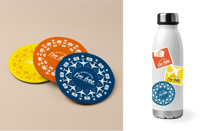
Use the following guidelines to guarantee legibility and brand integrity when ordering promotional materials:
- White, dark blue or orange backgrounds are preferred colors for objects.
- If preferred colors are not available, contact our team to determine other color options.
- Make sure there is enough contrast for legibility.
- Place logo only on solid colors, no patterns.
- The logo should always appear in the approved colors.
SAMPLE CAMPAIGN
TOBACCO-FREE CAMPAIGN
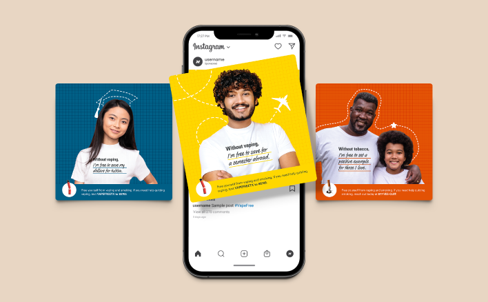
Pulling inspiration from the brand elements of the wider Eliminate Tobacco Use initiative and health communication research and best practices, this sample campaign can be used by a variety of institutions of higher education to promote tobacco- and vape-free environments. The campaign materials feature members of our priority audiences – students, faculty and staff– and use positive message framing to communicate the benefits of a life free of vaping and smoking.
WITHOUT TOBACCO, I’M FREE TO ______
Being vape-free or tobacco-free means you are “Free to ____.” The possibilities seem almost limitless. Being vape-free and tobacco-free is freedom.
The flexibility of the “I’m Free to” campaign makes it possible to emphasize a range of potential benefits of being vape- and tobacco-free: physical, financial, social, etc. This campaign promotes independence by encouraging a mindset of “freedom” and a fill-in-the-blank choice of the reward one receives with smoking and vaping cessation.
The phrase “I’m free to ____” is versatile. Benefits of this campaign approach allow for:
- High potential for personalization across audience types
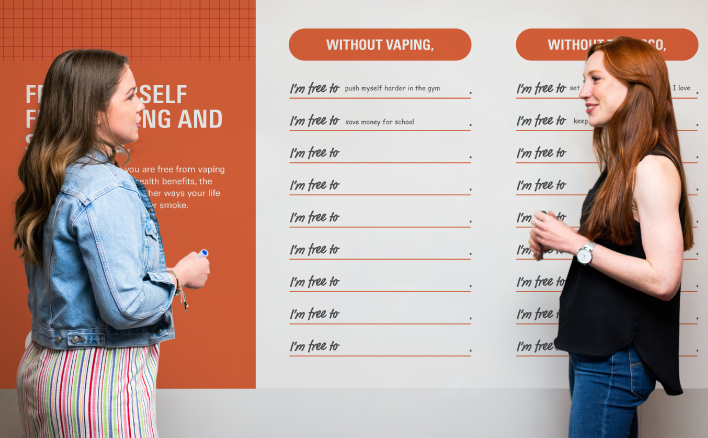
- Members of your campus to speak for themselves via the “I’m free to ____” prompt
- The ability to make connections to prevention, cessation and policy with a single type of message
- A focus on various benefits ranging from physical to social to financial
- Autonomy for each campus to implement the campaign locally in ways that resonate with them
SAMPLE MATERIALS
The following materials are provided as examples and inspiration for using the Tobacco-Free campaign. The materials can be adapted and tailored to your specific campus’ needs.
If you would like assistance customizing these materials for your campus, please contact the UT Center for Health Communication at healthcomm@austin.utexas.edu.
SOCIAL MEDIA ADS
DIGITAL DISPLAY ADS
INTERACTIVE EVENT INVITING RESPONSES FROM CAMPUS
PROMOTIONAL MATERIALS